RESEARCH
RESEARCH FOR PROJECT
1.
JONAH HILL ADVERT FOR PALACE


London is a key focus for the sportswear market, for both performance sportswear and sports fashion. This market sets more trends than anywhere else in the country. London 2012 gave Adidas a platform to target this audience but with a global reach. So in this case Adidas clearly find London a pinnacle point in selling their clothing , and that's where Palace sell their clothing as well. So that's what i want to do in my post production work. I want to include that hint of London so that the Target audience understand where it is based.
max - I can see what they are trying to do, make it badly edited so it seems funny. But it doesn't really show the product that much.
As you can see they don't really understand the advert that much. Which what I am going to try and attempt. Palace doesn't really attempt to open the marketing of there franchise. Maybe this is because they are like a streetwear brand that has its own target audience. But this is what I am going to change. I want to create an advert for the people that know the brand and the style of adverts they make for the people who don't know palace to give them an insight into the hyped brand.


ANALYSIS ON TWO DIFFERENT ADVERTS
Explain why TV adverts are important to TV producers and manufacturers – why are they such a powerful and necessary tool?
We live in a culture bombarded with promotional messages. These messages come from traditional sources like TV and newspapers but also on coffee cups, billboards, catalogues, T-shirts and the like. The competition for the eyes and ears of the British consumer is fierce. Getting attention fosters the awareness that is the first rung of the advertising action hierarchy. It is so very critical to creating sales of an advertised product. Adverts are everywhere.
1.
John Lewis Christmas Advert 2015 : Man On The Moon
Link to video : https://www.youtube.com/watch?v=jGY-T4W-BOc
Story line: This is the story of a young girl called Lily. Looking at the moon through her family telescope one night, she is amazed at what she finds, a man on the moon.
Lily watches on as our man goes about his chores, all alone up there. She becomes determined to get something to the moon, to send him a message and show him that someone down here is thinking of him. The music is ‘Half the World Away’ performed by Aurora, the original song was by Oasis.
the Target audience :
John Lewis have been very clever with their adverts this decade ,There consistency to deliver the annual Christmas adverts titles them as the grand master of delivering emotional, magical creative adverts. The masterstroke – and why I love this ad so much – is that it is tied up with Age UK to ensure that all this heart string tugging isn’t for nothing. They clearly aim this at adults, and they reason why i believe this is because it’s as if they are hinting to the families that despite you have everything around you that you love, there are some really lonely people out there at Christmas. It’s a real tear-jerker. Even though this has no relation to my video , it conveys the emotion and how they use it in adverts.
The way the advert was built and prepared:
The production designer 'Chris Oddy' built a set which was supposed to resemble the moon, the reason why it was supposed to resemble the moon is because it shows how people can be so distant at Christmas, obviously they are not on the moon but because they are so lonely it’s almost as if they are. The music fits in very well with the advert.
This has some link to my video in terms of emotion, the advert clearly hits people in a different way to the way i want to convey my emotion, but the advert is so powerful.
CONNOTATIONS
The advert also includes connotations resembling the moon which is rarely visited so that’s the de-notation. However John Lewis resembles the moon as a lonely place where humans lonely are.
EDITS AND SET
Its invisible edits where it shows the telescope zooming on the little girl show how well it has been edited. But not of all it has been edited. John Lewis built the set where the man is on the moon, this brings a sense of realism and creativity and also shows how much effort was put into this advert.
JONAH HILL ADVERT FOR PALACE
Jonah hill’s last appearance for the Palace X Reebok collaboration was an ironic take on cheesy celebrity commercials. “We wanted to make something really stupid,” founder Lev Tanju said. In the new video, the actor makes a cameo role bitching on the phone, “I don’t need to be doing these stupid little skateboard advertisements for fucking stickers,” he says before he is confronted by a large shape shifting, metal structure.
This advert is a little more relative to the project i am doing. They have deliberately made this advert look bad to make it funny. It’s quite a 'wacky' advert however the overall target audience for this brand like this sort of humour. The props they use in this advert such as the trainer don't really have an impact on the adverts theme however the way it has been edited it has. They deliberately make the green screen look rough so it brings that sense of realism to the video. And the fact they have Jonah Hill in the advert makes no sense. Linking back to the idea of this wacky advert.
''What I love most about this spot is the idea: Let's have Jonah Hill be our spokesperson but we green-screen him into the Palace store'' (for effect, not to save money) and have him pretend to be reading cue cards . They consciously went for super bad.
The effect is pure advertising entertainment. The green-screening is wonderfully awful, as if it's trying to be good. When he walks across the floor he moves way too fast. He pretends to engage with someone in the store and his gaze is off by about 30 degrees. In the beginning he walks toward the store and misses the door And his body-size fluctuates while standing near the fitting rooms.
https://www.youtube.com/watch?v=sXoRZfClf0Q
RESEARCH
The first thing i did for my research other trainer adverts. Look at the generic theme of how they present a trainer in billboards , videos and posters. Despite Nike’s market dominance, Adidas has continued to make its presence felt as a very strong player in sports shoes and apparel industry. Considering its performance during the last few years, Adidas has made a quite but impact return. Adidas always go back to their portfolio on on marketing strategies. However, they sometimes mix it up. When I mean that I mean collaborations. Rare pieces of trainers that have so much hype in the streetwear world and that is what i am doing for this project, I am presenting one of the most hyped brands collaborating with another huge brand; Adidas and Palace.
The founder of streetwear brand Palace, Lev Tanju is responsible for London’s most prominent and buzzed-about skate company. Although Tanju is quick to point out he never intended for Palace’s appeal to transcend the skating community, the young company has become one of the most exciting street culture brands. So considering how hyped up palace is when they announced a 'collab' with Adidas people were very happy. so conveying on an advert is important, to make sure i get that excitement up for the audience.
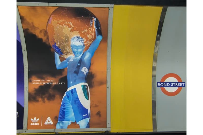
But we are going to analyse the marketing side of these projects. Adidas have done many projects with Adidas since the form of palace in 2009. Not long ago, Palace revealed its latest collaboration with Adidas Originals via advertisement at London’s Tottenham Court Road underground station. This time around, the notorious sportswear label took to Instagram to unveil a new ad at the Bond Street tube station. All in all, the pictorial seemingly pays homage to the Greek Titan god, Atlas, showcasing a human figure holding up the world while ostensibly donning a pair of jersey shorts. Conclusively, this second ad bears a resemblance to the initial one as it features Greek lettering which more or less translates to “Palace x Adidas” and “Other sportswear is a myth.”
 As you can see this also relates to the palace billboard. Where the colours are inverted and unique. Exactly what i want to do with mine. the graphics are what I want to do, use and change so it fits the design i want to use.
https://www.youtube.com/watch?v=sXoRZfClf0Q
RESEARCH
The first thing i did for my research other trainer adverts. Look at the generic theme of how they present a trainer in billboards , videos and posters. Despite Nike’s market dominance, Adidas has continued to make its presence felt as a very strong player in sports shoes and apparel industry. Considering its performance during the last few years, Adidas has made a quite but impact return. Adidas always go back to their portfolio on on marketing strategies. However, they sometimes mix it up. When I mean that I mean collaborations. Rare pieces of trainers that have so much hype in the streetwear world and that is what i am doing for this project, I am presenting one of the most hyped brands collaborating with another huge brand; Adidas and Palace.
The founder of streetwear brand Palace, Lev Tanju is responsible for London’s most prominent and buzzed-about skate company. Although Tanju is quick to point out he never intended for Palace’s appeal to transcend the skating community, the young company has become one of the most exciting street culture brands. So considering how hyped up palace is when they announced a 'collab' with Adidas people were very happy. so conveying on an advert is important, to make sure i get that excitement up for the audience.
I take huge inspiration off this poster. Linking back to my ideas , I wantreate a glitch like theme for my web ideas and billboards. Despite this not being in any relation to my product and the philosophy around what i want to do. The artwork on album Is what i want to do to mine. The thermal graphics and glitch like effect is really cool.
As you can see this also relates to the palace billboard. Where the colours are inverted and unique. Exactly what i want to do with mine. the graphics are what I want to do, use and change so it fits the design i want to use.
target audience
Palace has created a hugely successful community of followers with their skateboard and skatewear company.
The tri-star logo of Palace skateboards is iconic and can easily be spotted on the back of a shirt or the signature ‘P’ on a cap, therefore carrying a strong brand image.
A weakness to Palace is they promote their products mainly towards their male target audience therefore they could be limiting sales to the female target market. As a female who takes an interest in streetwear, it can be very intimidating knowing that a brand or store has all male employees, male manikins or solely promotes their products towards males.
Palaces adverts are so different, visually and sound-wise. Sound in my advert will take a big part. I researched Songs which may go well with my advert, the two songs i looked into were : WORST EVER CONTENDER https://www.youtube.com/watch?v=wuMUQnyNLDA JIMMY EDGAR https://www.youtube.com/watch?v=hXWNE4gjIko ' Worst ever contender ' is a really good song for a palace advert. The song drops and it sounds very distorted, exactly how palace adverts sound. Where the adverts are so badly edited that they seem so cool. I got people to watch Palace adverts to see what they think about it. The reason why I did this is that Palace adverts are very unique and different, if you know palace well and watch the adverts then you would find them funny. However, if you don't know what palace adverts are like then maybe you wouldn't understand the concept of what the adverts are. The video i got them to watch was the Jonah hill advert. The reason why is because the advert is so different. https://www.youtube.com/watch?v=sXoRZfClf0Q To understand more about palace print-based advertisements I looked into how they make posters. |
As you can see they are sticking with 90's theme. This is what I want to do with my project, The text and the filter make it look very retro.

With this poster hey are clearly showing this is a palace based ad. They are showing a message saying ' London is burning '. Indicating that when you wear palace you are fire, e.g. Looking cool. not only that the poster shows a lot of ironies, the man wearing a hoodie saying safe whilst on fire.
There is a common theme on the palace print-based adverts and that is showing hidden messages.
However, with the palace x Adidas print-based projects they don't seem to convey messages as much as they do on there own 'look-books'. This could be because It's a big collaboration which is used a way of palace widening their popularity. Here is a look :
So with my project , considering it's palace x Adidas I need to make sure i do the same. Keeping a recurring theme throughout the print based and video projects is so important. It just makes it look so professional.
London is a key focus for the sportswear market, for both performance sportswear and sports fashion. This market sets more trends than anywhere else in the country. London 2012 gave Adidas a platform to target this audience but with a global reach. So in this case Adidas clearly find London a pinnacle point in selling their clothing , and that's where Palace sell their clothing as well. So that's what i want to do in my post production work. I want to include that hint of London so that the Target audience understand where it is based.
Palace has created a hugely successful community of followers with their skateboard and skate-wear company.
The tri-star logo of Palace skateboards is iconic and can easily be spotted on the back of a tshirt or the signature ‘P’ on a cap, therefore carrying a strong brand image.
A weakness to Palace is they promote their products mainly towards their male target audience therefore they could be limiting sales to the female target market. As a female who takes an interest in street wear, it can be very intimidating knowing that a brand or store has all male employees, male manic ans or solely promotes their products towards males. so my target audience is 15 and 20.
PRIMARY RESEARCH :
PRIMARY RESEARCH :
Oscar - I sort of know what palace is but I am struggling to understand why they made the advert like this
max - I can see what they are trying to do, make it badly edited so it seems funny. But it doesn't really show the product that much.
As you can see they don't really understand the advert that much. Which what I am going to try and attempt. Palace doesn't really attempt to open the marketing of there franchise. Maybe this is because they are like a streetwear brand that has its own target audience. But this is what I am going to change. I want to create an advert for the people that know the brand and the style of adverts they make for the people who don't know palace to give them an insight into the hyped brand.
I did a survey to people to see what they know about the brands around Palace.


Comments
Post a Comment